I recently noticed some changes over at Flickr that have been in effect for a month or two and I got quite excited. You see, I started this blog in order to control how my photographic images were presented on the web. Although I love Flickr as a place for photographers to share their work and perhaps provide each other feedback, I found the relative busy-ness of the page distracting. I felt I could not view or show images in the manner I wanted. That frustrated me. I was much more impressed with how Picasa formats their viewing page.
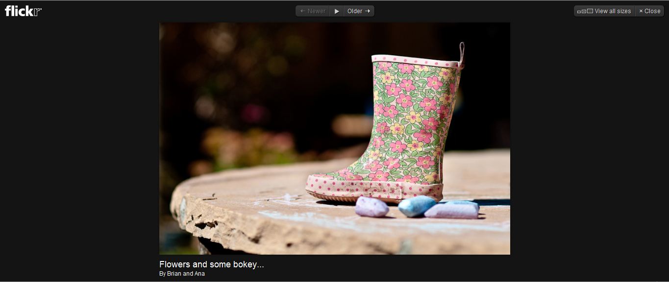
Well, I am very happy to discover Flickr was listening to me. Well, OK, they probably weren’t really listening to me but they addressed the issues that had become near and dear to me: page layout, optimal viewing environment, ease of use and movement between images. Now there is the option of viewing individual images without all the distracting sidebar links. By clicking directly on an image (when on the image page) Flickr navigates you to an “on black” viewing area they call “lightbox” thereby providing a pleasing viewing experience. On the page are just a few discreet yet accessible buttons. These buttons allow the viewer to navigate forward or backward through the photographer’s photo stream, to start a slideshow of the photographer’s photo stream, or to view the current image in all its available sizes. An example is shown below.
Other improvements include more streamlined ways to add tags, notes, and people to images as well as ways to share the images through blogs, email and link acquisition. There is even a very easy way to link your Flickr updates to FaceBook making the need for third party apps obsolete. It is seamless and very user friendly. These are all very nice updates and will speed up the way images are viewed on Flickr but for me the improvement in the viewing environment is the biggest thing. Thank you Flickr, you have rescued my enthusiasm for your site.
To view my Flickr stream feel free to click on the photostrip at the bottom of this page or follow the link here.


Yea for the Flickr changes! They were sorely needed. Your excellent work deserves to be complimented, Brian.